

East Harlem
New York
USA
Residential Building
21,500 gross SF
15,000 net SF
3,750 lot SF
20 units
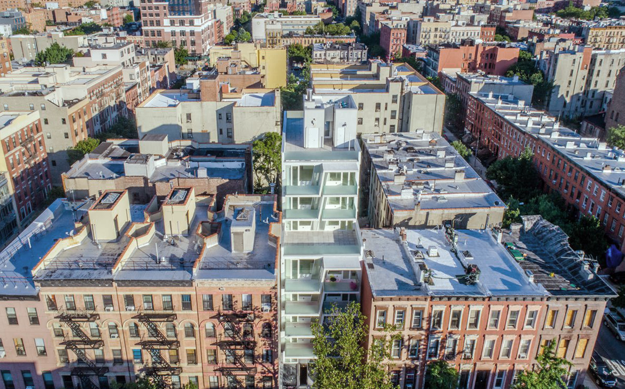
329 Pleasant Avenue is designed to redefine the prototypical low income New York City rental building. Located in a sleepy area of Upper Manhattan’s Spanish Harlem, the building is tucked away on a narrow lot between a 100 year old brownstone and a pre-war tenement building. The building is a mix of small 450 SF Studios and 650 SF 1BR apartments.
The challenge was to create a luxurious sensorial living experience with very limited means. In a city with very high construction costs, low income rental buildings are usually devoid of good quality, design and character. Our approach was to break down the rental world stereotype and start from scratch, rejecting the use of predefined building templates.
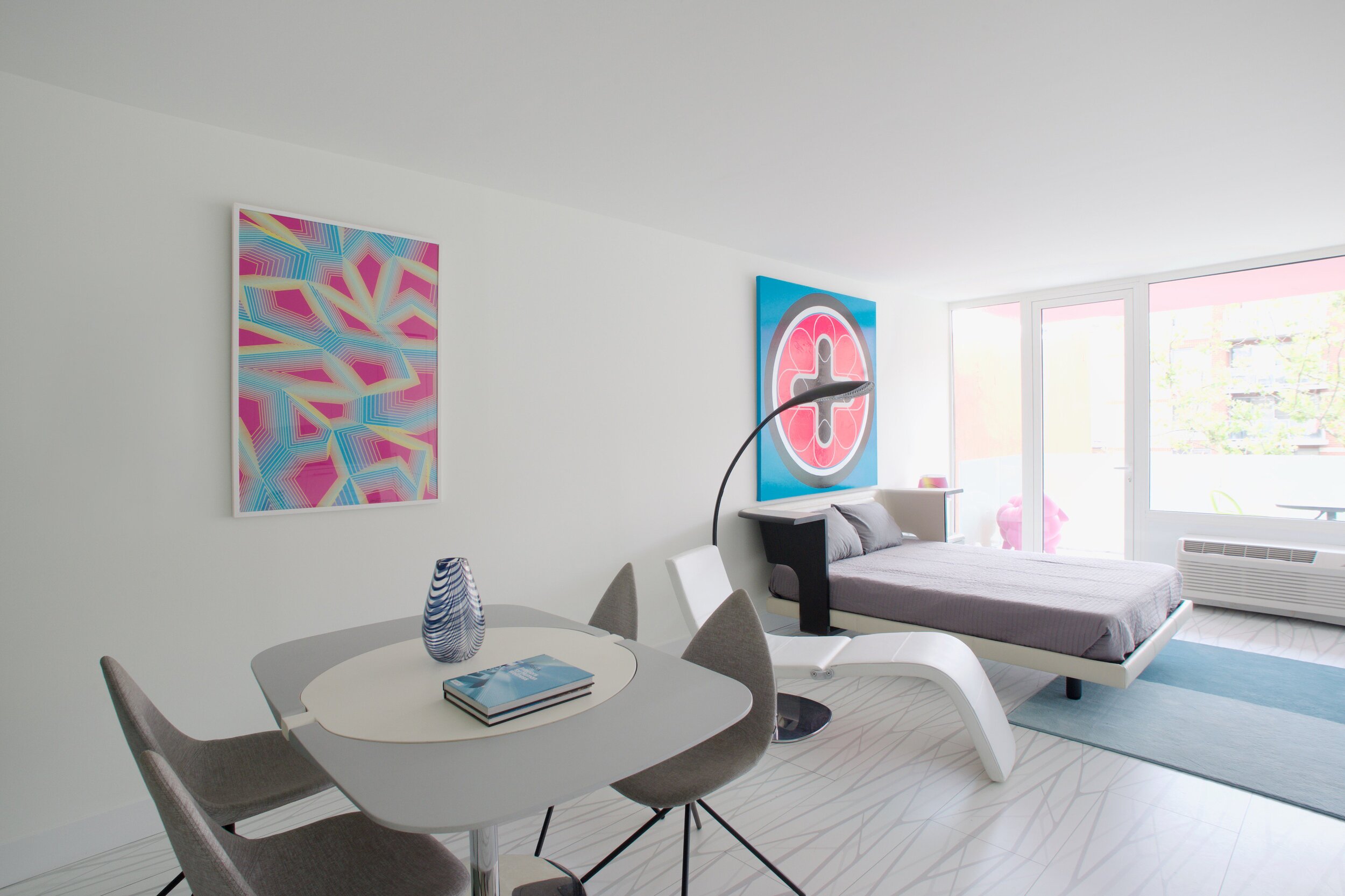
Our biggest challenge is to ensure that the small spaces feel as clean cut, large and bright as possible. Several unique design decisions were made to ensure low cost and high quality;
Floor plans were laid out so that spaces were wide open and free of clutter from mechanical or structural interruptions. Therefore all infrastructure was placed in lateral demising walls, which in turn act as the unit’s storage and kitchen. This unique assembly not only clears up space on the floor plan, but it also provides a six foot deep separation between units, which performs incredibly well for sound isolation and acoustic absorption between tenants. The apartments feel wide open, are super quiet and have more storage space than any other comparable apartment in the city.
To solve the problem of the site’s narrow-deep lot which is typically prone to dark interior spaces we spent our resources on the building’s envelope. Instead of the usual small punched window openings, 9 foot floor to ceiling window wall glazing was employed to ensure that light penetrated as far as possible into the units. Internal bathrooms are then partitioned with translucent privacy glazing to allow this natural light to penetrate deep into the building. In the larger 1BR units, the full 35’ width of the lot is perceived by partitioning spaces with glass pocket doors that can be retracted to allow deep visual perspectives, making the sight lines in the space feel longer, larger, more ample than normal. In addition to the full height glazing, each unit receives a 7 foot covered terrace, adding 120 to 240 sf to each apartment, something unusual in New York City buildings. The space is large enough for a full size dining table, when the weather permits being outside.
We also worked hard to ensure modularity. For example, all kitchen units are all identical throughout the building. The idea of modularity and the economy of the repetitive unit is exercised to the maximum through the building.
Hardware, appliances, flooring, wall coverings and material finishes are all personally designed by Karim Rashid and produced by his industrial design clients.
It was important to Karim that the result of his work manifest into something that would deeply connect with the end user and sustain relationships with the consumers of this space.
5 -7, 9 Photography by Karen Fuchs
Photography by Alex Loyer Hughes
+